


Sorry for the picture-heavy post today, but this has been a long-time in coming;) I promised to post on the packaging for my audiobook, but I wanted to wait until a few people had the thing in their hands, so I didn't completely spoil the surprise for everyone!
Yeah, I went overboard on the details, but it was fun;)

I started with a paper mache book box; you've probably seen their decorated cousins in stores, usually covered in generic designs with the Eiffel Tower or botanical prints. I found the blanks at my local craft store. The interior was just large enough for my 12-CD case with a little room for padding.

The inside cover then got old Union Pacific broadsides or schedules decopaged in. Each one had a slightly different page with quaint notices about train etiquette or what a ticket to Boise costs. Since a large part of the first section of the book deals with the protagonist on a train, I thought this was appropriate.

Then, the box side got a layer of batting glued in. Oh, hot glue gun, you're the best.

A layer of brown dupioni silk comes next, also glued along the edges so it fit snuggly to the bottom and was smooth and didn't shift around.The sides were tucked in and glued down then, and that was the cushioning for the CD case.

My "bookmark". Since the case fit pretty snug once its in there, I had to add something to lever it up out of the cushioning.

Here's the blank case sitting inside . . .

The most work went into this little folder. It doesn't look like much right now; just a kraft paper 4-fold petal envelope that I cut out from my own template and glued inside the cover. I added two brass brads to attach black string to, so I could band it closed. You'll see what's inside in a moment.

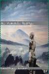
The finished CD case. that's the cover of the actual book, just reproduced for the outside of the case. The back has the listing of which chapter is on which disk.

Here's what you get when you open up the envelope inide the cover. I drew portraits of the main characters, scanned each one, used illustrator to turn them into vector images and then put them on a parchment backing. I then formatted them into this accordion insert. Technically, it's two pages that are glued down to look like one long insert.

On the other side, I included a feature that readers get in the actual book: the map of Outcast. I figured it might be useful once someone is listening to refer to the map and figure out where characters are.
I don't really have progress pics for the outside of the box yet; I was in a hurry when I was doing the last boxes, so I'll try to take pics when I make this batch and I'll post them then.
Stay tuned!


1 comment:
Wow that's really beautiful. I love the portraits :)
Karlene
Post a Comment